Background
My work for Take was the precursor to launching a new product. The startup was in the earliest stages, and my work helped conceptualize and bring their product to life. I was the sole UX/UI designer on this project and focused primarily on interface design, though I also conducted multiple interviews to ensure the intuitiveness of my designs. I also worked with Keslie Egbert, a graphic designer, to incorporate effective colors, fonts, and a few custom icons throughout the app. Spencer Adkins and Jesse Myrick, the owners of the startup, also provided their feedback and helped mold the design; my work is included with their permission.
Purpose
Take is an innovative new social media platform designed to bring discussion to a safe platform. It allows users to record videos ("Takes") of themselves and invite others to respond, imitating an in-person discussion. Takes can be sorted into pages that allow users to browse topics and key arguments, fostering an environment of understanding.
Constraints
I was hired for just ten hours a week for a month and a half, so I only had about 65 hours to complete the project. This gave me two weeks for wireframing and user research and three weeks to create a 74-screen high-fidelity prototype.
Research
Because I don't use many forms of social media on my phone, the first thing I did was to examine multiple major social media platforms, including Facebook, Instagram, and Marco Polo, and compile a list of conventions.
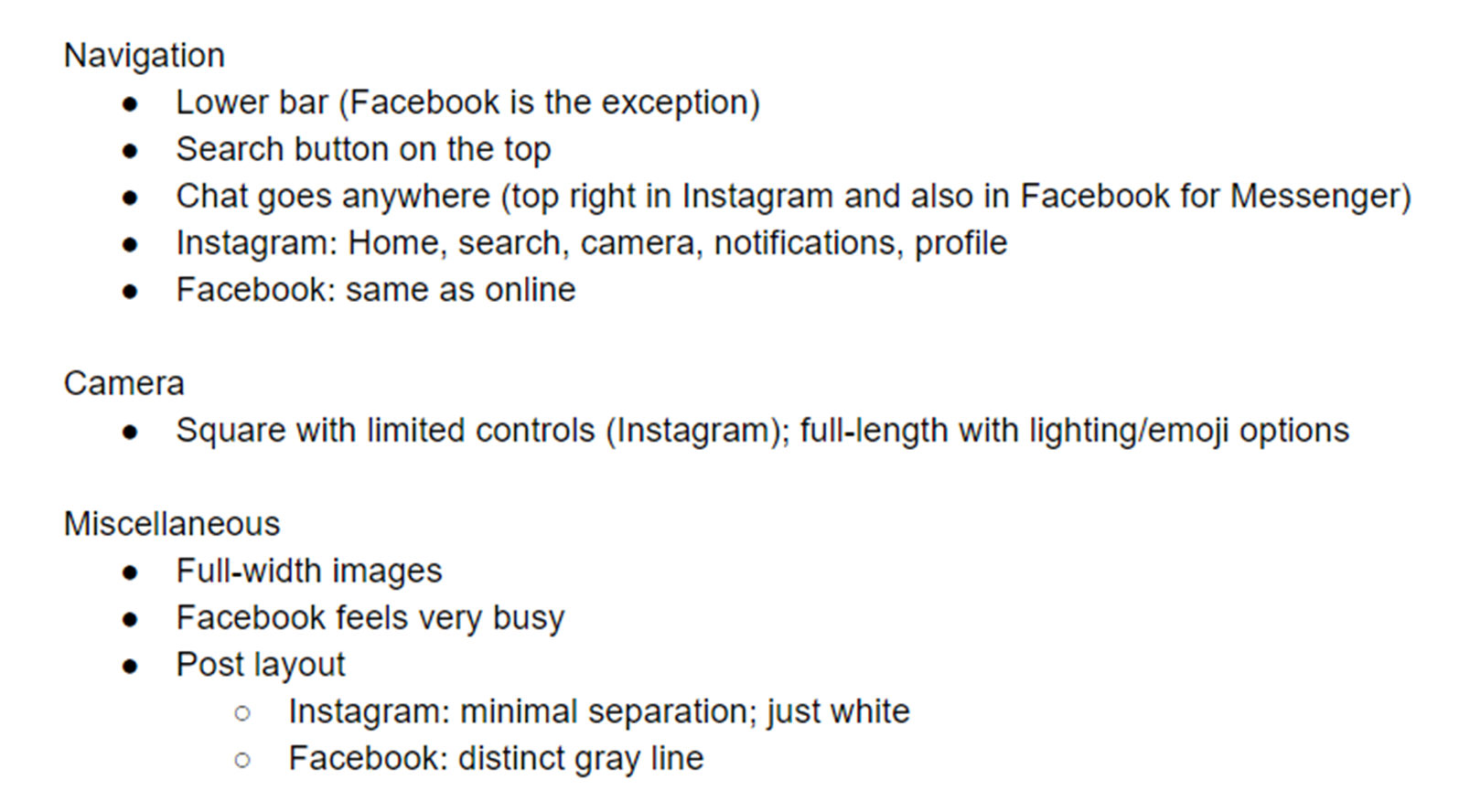
List of social media conventions.
This crucial process helped me know what design layouts were out there and what standards I ought to use when designing Take.
Design Process
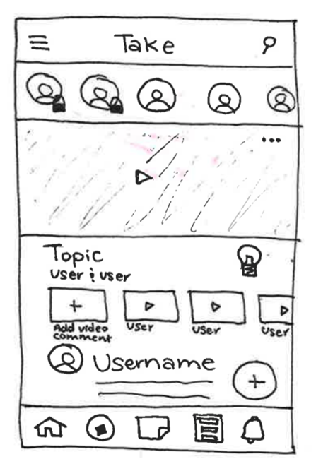
After formalizing my understanding of social media apps, I began wireframing. I focused primarily on creating and displaying Takes since users would primarily be engaged in these functions. This meant that I spent a considerable amount of time designing the homepage.
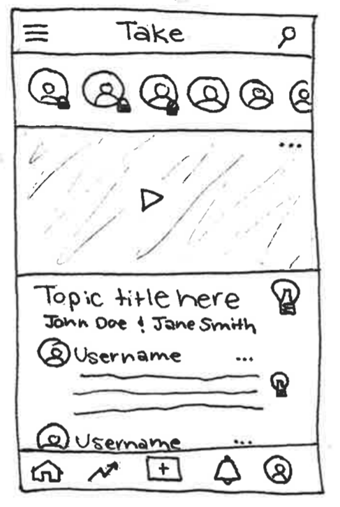
First homepage iteration.
With the first round of wireframes complete, I interviewed 13 people to see how they would interact with the designs.
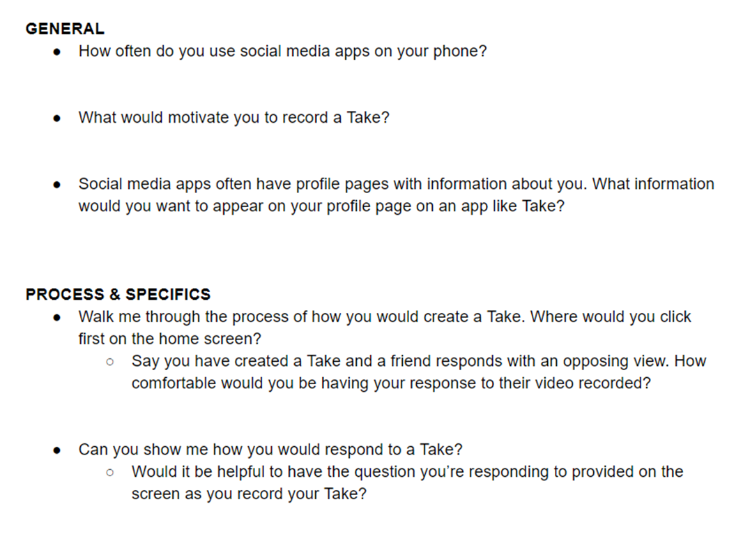
Sample of the questions asked in the first round of interviews.
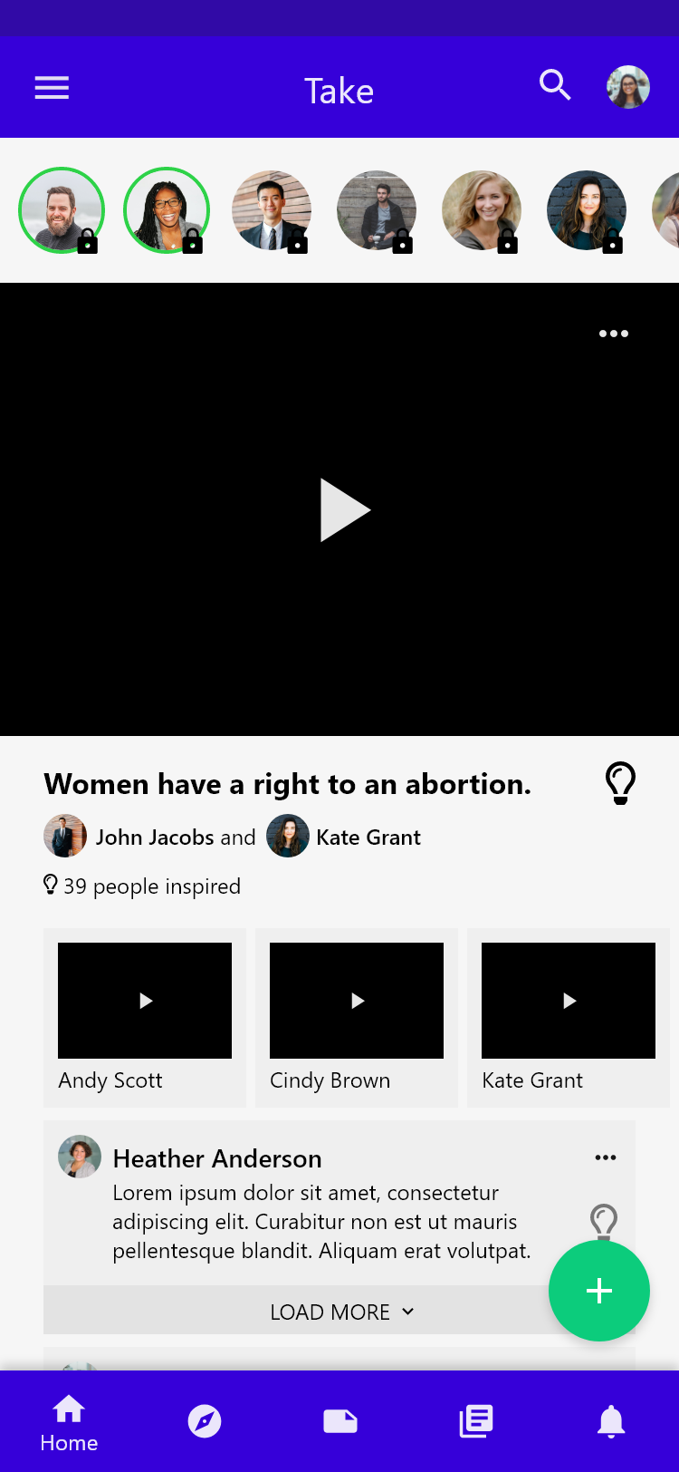
To my surprise, users struggled with even the most basic tasks, such as starting a new Take. After a high proportion of the users failed the tasks, I knew I needed to make the design more intuitive, so I created a second set of wireframes. Most notably, I updated the homepage to include a floating action button that served as a direct call-to-action to start a new Take. I also incorporated video comments as requested by Jesse and Spencer.
Second homepage iteration. I added a direct call-to-action to start a new Take.
While I only had time to test a few users with the new design, it seemed like my design changes were more intuitive. I wish I could have had more time to test with users to ensure the changes really were effective, I reached the deadline for the low-fidelity design. Consequently, I began prototyping in Adobe XD. I based the design system loosely around Material Design due to its widespread use and use of good design principles.
For the first iteration, I just transferred my ideas to XD. I used some of the colors my bosses had been interested in, but they were more placeholders until the graphic designer sent me the new color scheme.
First mid-fidelity prototype. The colors used here were placeholders.
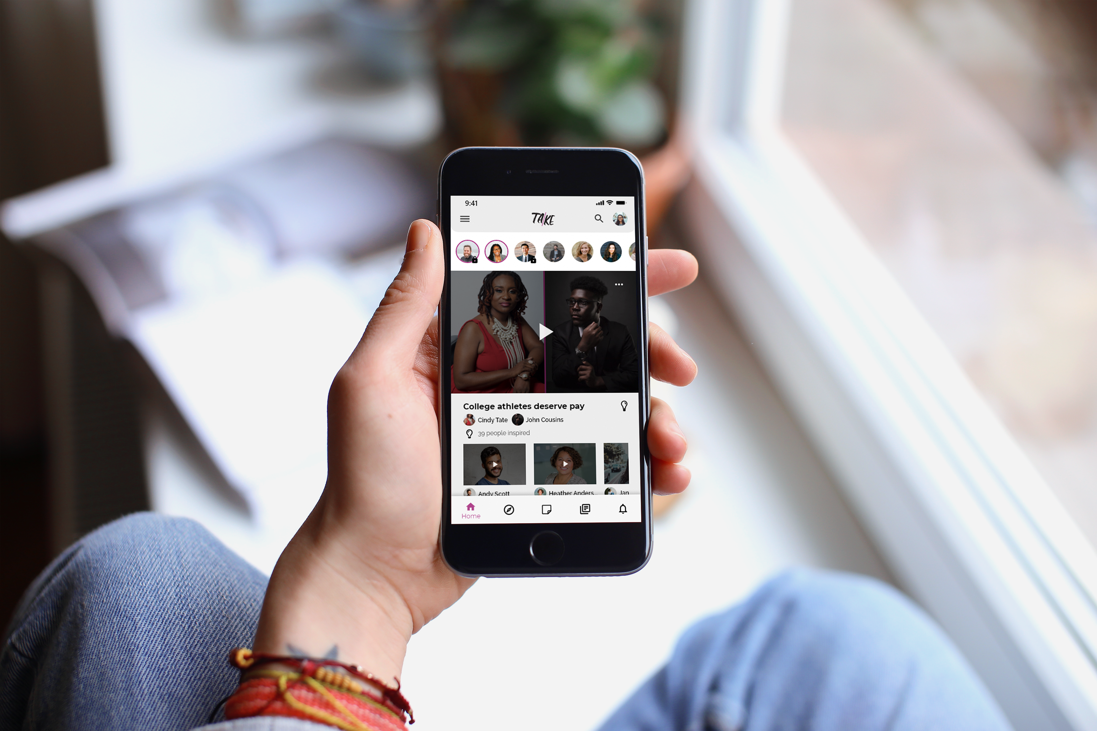
During the high-fidelity prototype phase, my designs helped Jesse and Spencer understand the product they were trying to build and forced us to really think critically about what should be included in the app. The homepage in particularly continued to evolve as we first eliminated all text comments, then eventually added the user's stance for each video comment.
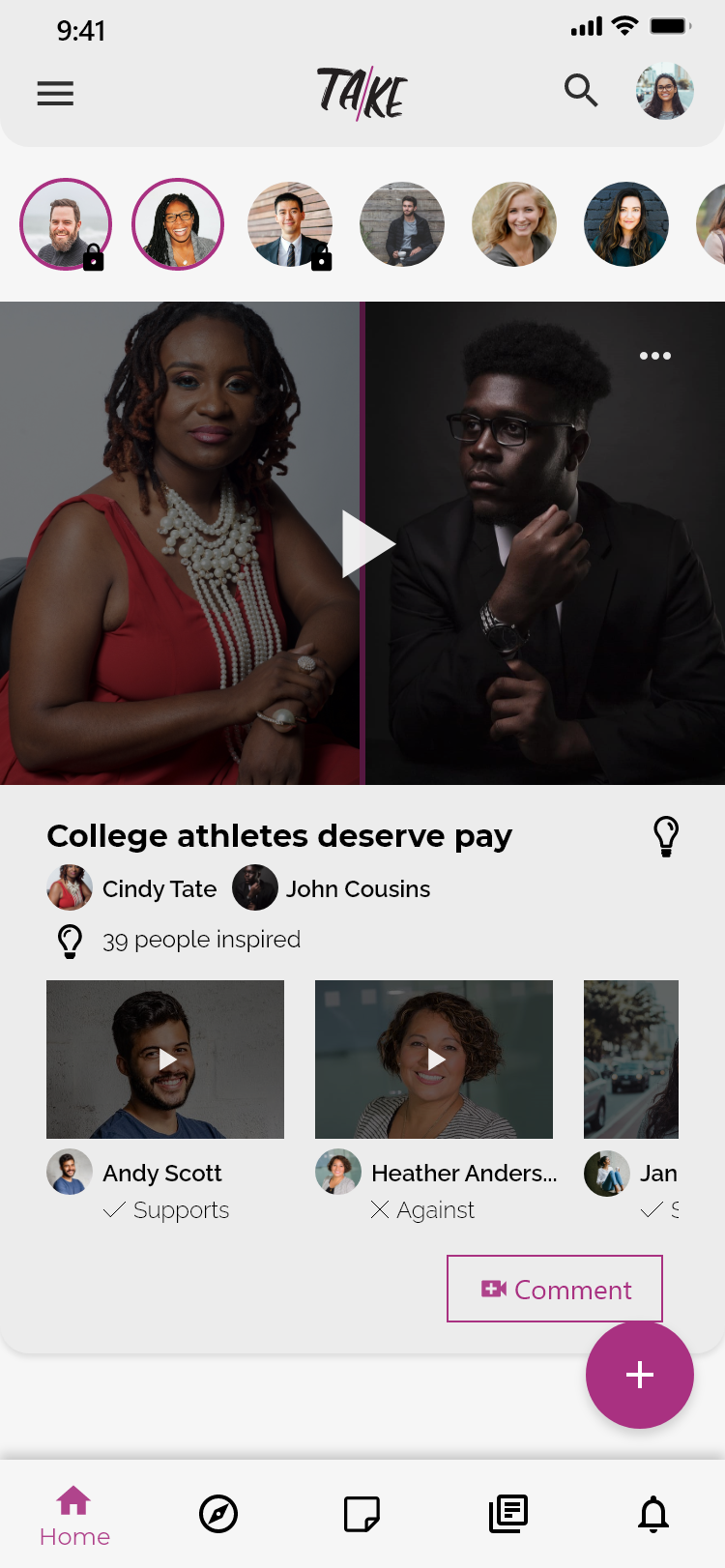
The final design of the homepage included just video comments and incorporated the user's stance on a particular issue.
Lessons
This project gave me personal experience learning the necessity of user testing. In my first set of wireframes, I thought I had designed an intuitive system, but the users taught me that I needed to make critical changes for the app to be usable. Thus, this project increased my appreciate for thorough testing.