Lecture Preparation is a site that allows professors to request demonstrations for their courses.

Background
I completed this project while working as a web developer in Brigham Young University's (BYU) Chemistry and Biochemistry department. In addition to full-stack web development, I was responsible for all of the UX research and UI design of the Lecture Preparation site. Two coworkers provided periodic design critiques; their assistance is gratefully acknowledged.
Purpose
Lecture Preparation is a site run by BYU's chemistry department and facilitates the order and delivery of demonstrations for professors' lectures. By linking professors with a fulfillment team, Lecture Preparation allows a streamlined way to ensure orders are prepared and delivered to lectures on time, enhancing students' understanding of complex concepts.
Constraints
Because I was employed primarily as a web developer, I had less than two months to complete interviews and designs before beginning development. I also focused more on the process and user flow of the site rather than create a perfect high-fidelity prototype, so I didn't delve far beyond wireframing.
Problem
I was initially given an existing site ("Lecture Preparation") with the primary task of updating it to a new design system. While the updated design was certainly important, I discovered through interviewing users that the structure of the site needed to be altered to best focus on the way users navigated through the site.
Research
With the users' confusion at the front of my mind, I studied the structure of the site, then compared it to equivalent sites, particularly prominent e-commerce sites like Amazon, Walmart, and Smith's. I noted similarities and differences between the sites and Lecture Preparation. Surprisingly, Lecture Preparation shared very few conventions with similar sites. For example, Lecture Preparation's product page only had an "Add to Cart" button, requiring users to navigate to their cart to input the quantity and select customizations.

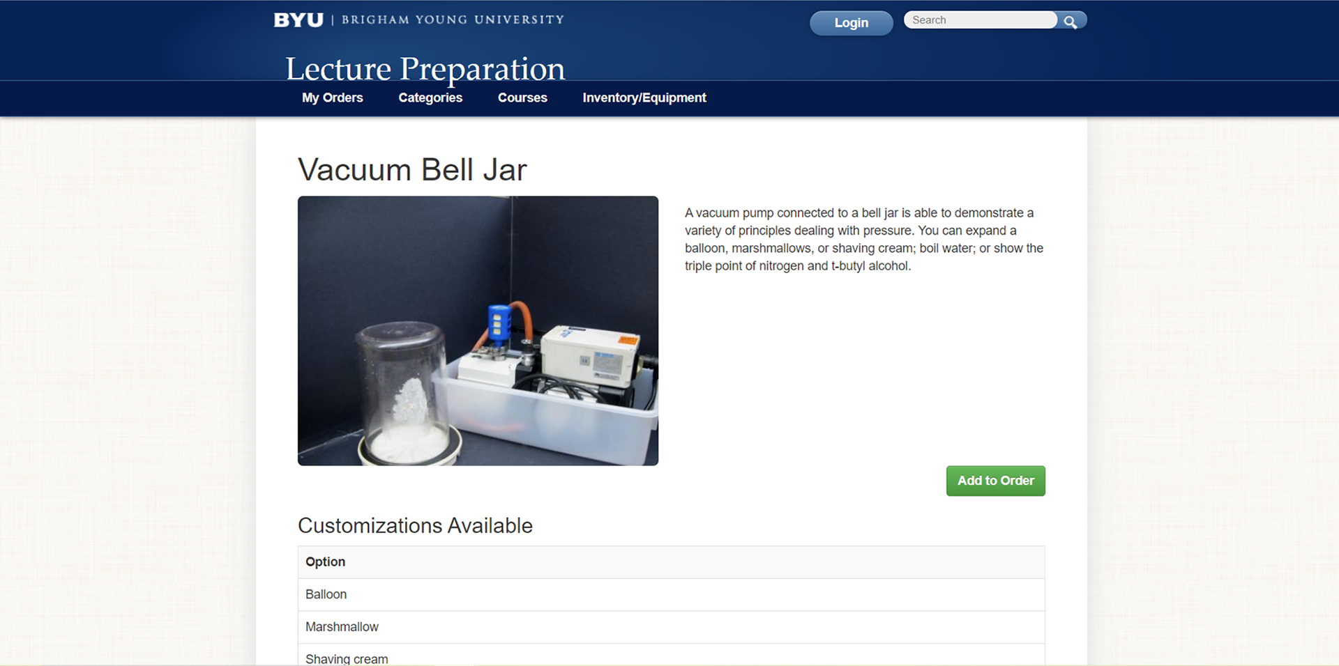
The previous Lecture Preparation site followed few e-commerce site conventions; in particular, the product page lacked the ability to input a quantity and select customizations before ordering a demonstration.

The conventions I discovered strongly informed my design process; I knew that using established conventions would be crucial to reducing users' confusion.

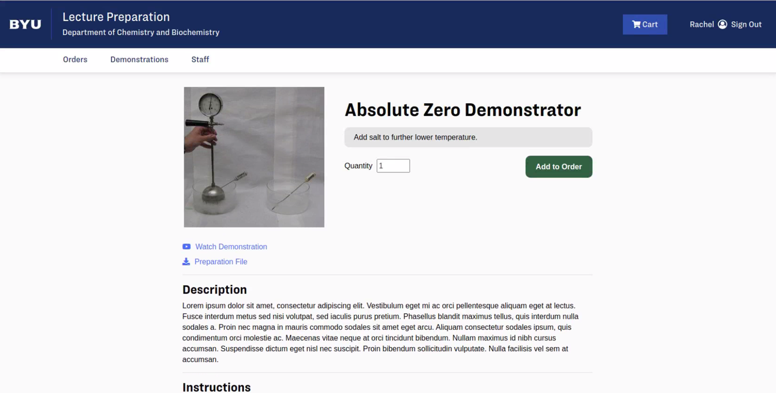
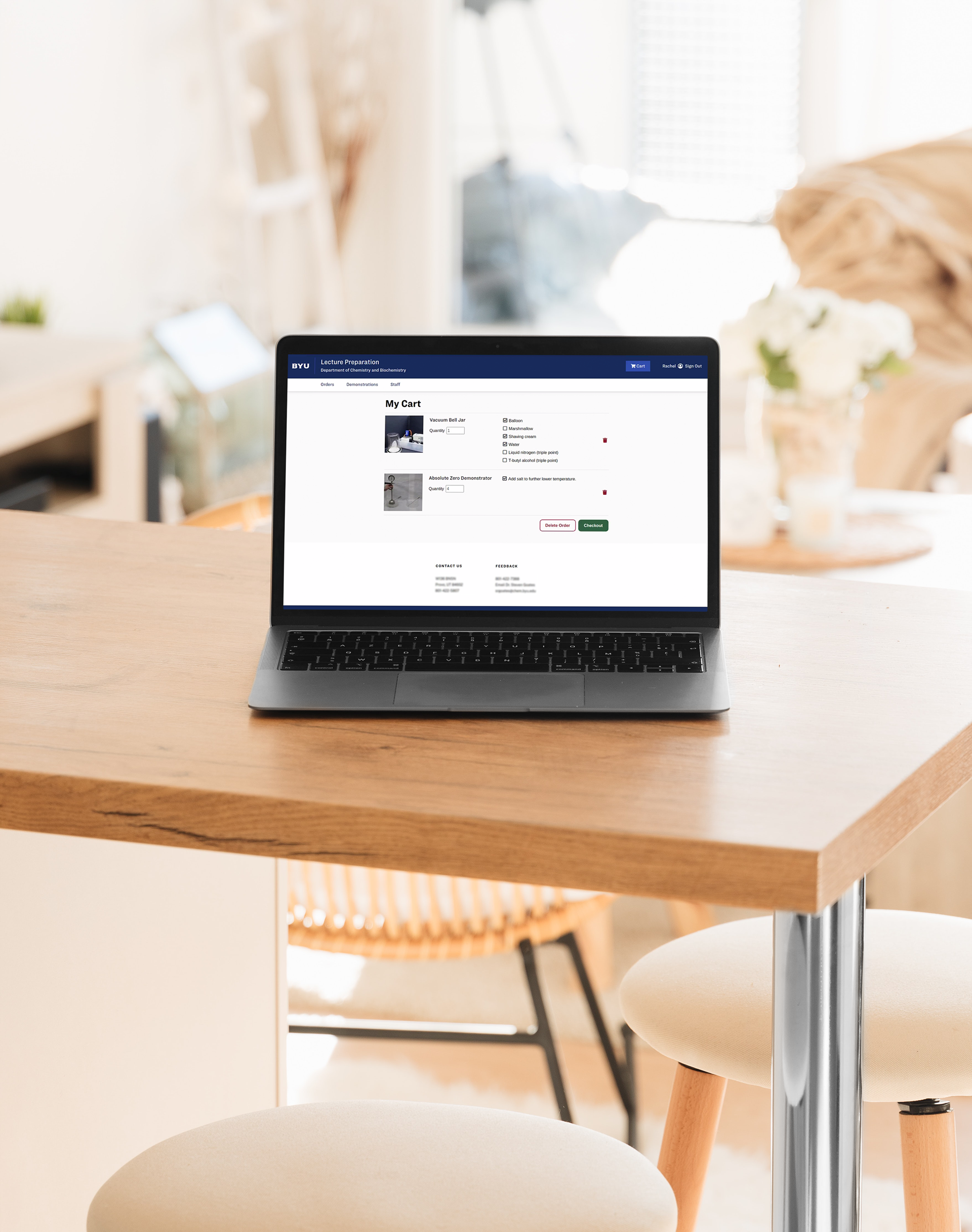
The redesigned product page followed e-commerce site conventions, including the ability to select options and input a quantity before ordering a demonstration.

Design Process
The first page I evaluated was the homepage, which contained design and UX errors, including confusing content grouping and overlapping images. It also featured a list of instructions on how to use the site, a sure indication of a flawed design.

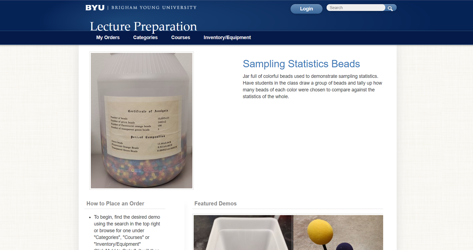
The original Lecture Preparation homepage.

While I knew I needed to fix these problems, it wasn't clear if I should keep the same content on the home page or not. I created multiple wireframes featuring different types of content, such as a featured demonstration and a compilation of randomized demonstrations.

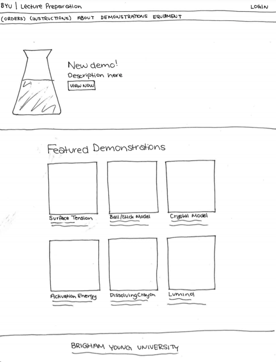
The first wireframe of the homepage highlighted a new demonstration as well as a randomized list of featured demonstrations.

While many of the users generally liked the wireframe, I realized that the vast majority of professors came to the site task-positive, knowing exactly what they were looking for. In fact, nearly all the professors I interviewed said they used the search bar to access the demonstration they needed, rather than navigate through the tabs of the site. To accommodate this need, I converted the main page into a search bar to allow professors to efficiently navigate through the site.

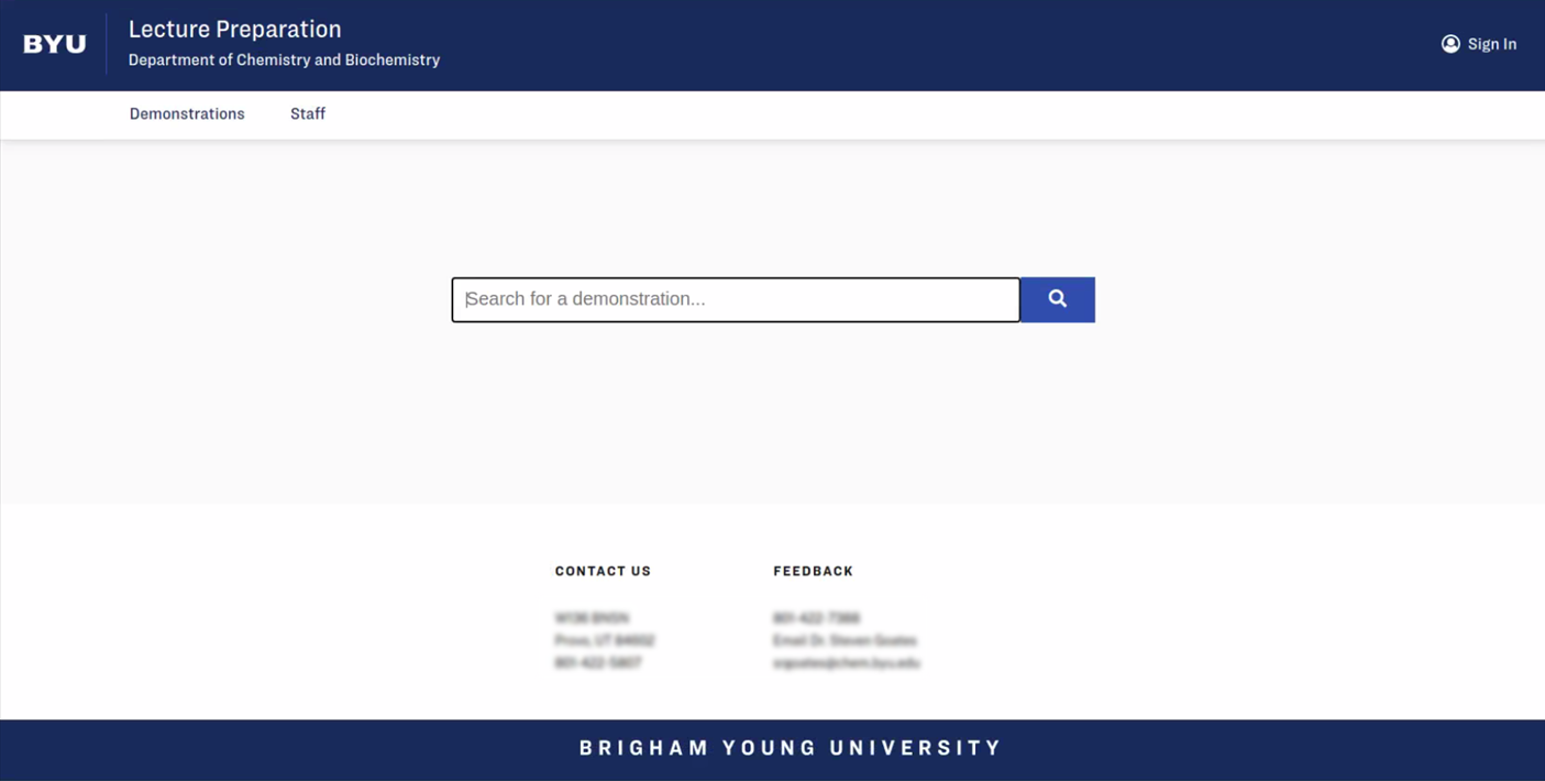
The new homepage in the early stages of development. A background image with a dark overlay will be placed behind the search bar.

However, a few users (including new professors) wouldn't come to the site knowing what they were looking for. This meant that I also needed to design an effective way for users to browse demonstrations. The old site had limited browsing ability and relied mostly on users to know which demonstration to select from the categorical drop-down tabs. There were pages to browse by categories, but again, they required users to know what the titles meant.

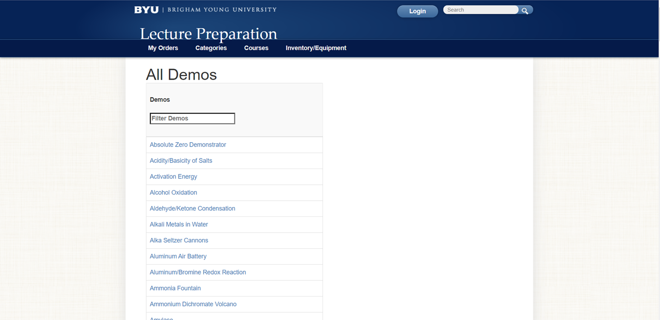
The previous site's page to browse demonstrations made it difficult for new professors to know what each demonstration was without reading through them all.

With the need for task-negative content and a better way for new professors to browse demonstrations, I experimented with different ways of sorting and displaying the demonstrations. The drop-down menus were being removed in this design iteration, so I needed a way to effectively sort demonstrations.

I first experimented with a single page that retained the search bar but used drop-down lists to link to each individual demonstration.

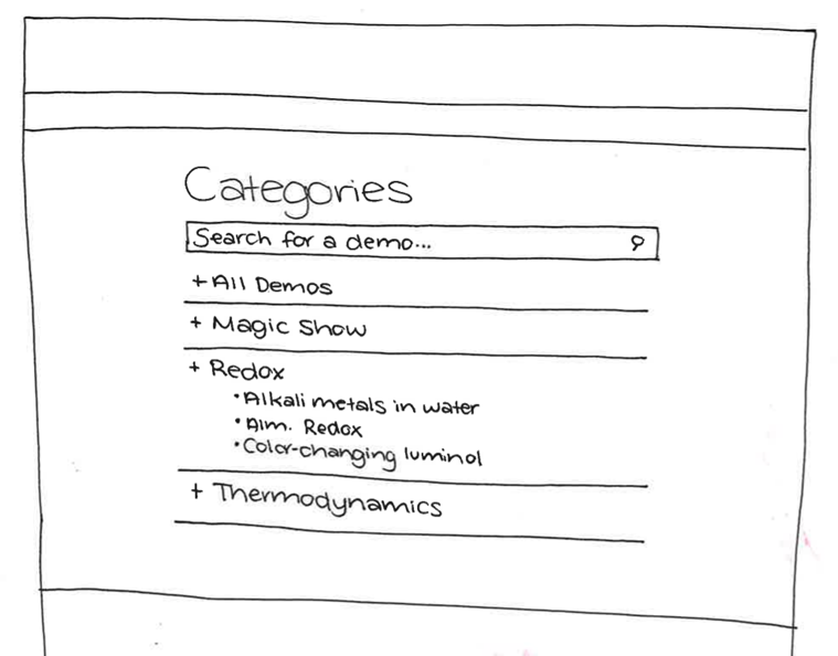
First iteration on how to sort demonstrations without a drop-down.

However, lists of links would not be effective at engaging users or allowing new professors to quickly learn more about demonstrations, so I continued to iterate. I ultimately redesigned the page entirely to include an image and short descriptive text. I also added a filter bar to replace the old tab-based categorization system. This key change combined demonstrations and equipment on a single page, allowing users to navigate seamlessly between different products.

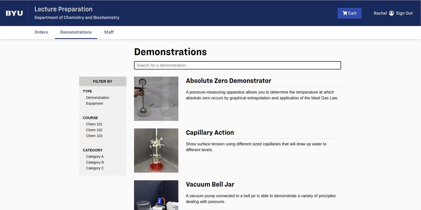
The final Demonstrations page. Task-negative users were enabled to browse demonstrations with these changes.

Lessons
The most important lesson I learned was the importance of iterating repeatedly before beginning to code. Because I had just enough time to do a few wireframes and a very basic high-fidelity prototype before I had to begin coding, I found myself having to make dramatic changes to improve the user experience of the site while I coded. In the future, I plan to push for more time to research and prototype to ensure they are effective before handing them over to the development team.

You may also like

Back to Top