The primary site for the BYU Department of Chemistry and Biochemistry.
Background
I was the lead UX/UI designer for most of the research and high-fidelity prototype stage of this project. My coworker, Darius Hughes, provided multiple design critiques that helped shape the design.
Purpose
The Chemistry site is the main website for BYU’s Department of Chemistry and Biochemistry. Its purpose is to attract prospective students, provide information to current students, and gather support for the department.
Constraints
I received this project after two of my coworkers, Bryce Grant and Aaron Page, had already performed initial research and design work. Because they were already in the high-fidelity prototyping stage, I was limited to making improvements within the existing prototype.
Problem
The previous version of the Chemistry site was created by a panel of faculty and staff members who listed desired features for the site. Thus, the site was tailored specifically to the needs of faculty and staff for the beginning. Even after the site was developed, faculty and staff members were free to request content on the site (even if it existed in another place on the site), which resulted in an overwhelming amount of often outdated information that was largely inapplicable to students.
Additionally, the vast amount of content that had accumulated throughout the years was hindering navigation. Analytics data revealed a bounce rate of 40%, with each user spending approximately one minute on each page. This indicated that users would come to the site, look through options to try to find specific content, but leave when they couldn’t find it. This demonstrated the need to eliminate extraneous content and display only what would be applicable to the targeted group of users.
This concern was further validated through a survey of the entire body of chemistry students. While many individuals described problems with the information, one student's response in particular highlighted the drastic need for change:
"I was trying to find the location of the academic counseling [office]... and instead found the number of feet of pipe in the building."
The quantitative and qualitative data led the product managers to change the focus of the site. Rather than concentrating primarily on faculty and staff, they determined that the site ought to be tailored to prospective students, current students, and donors.
With this shift in mindset, the Chemistry site needed a complete redesign that ensured efficient navigation and a layout tailored to the needs and interests of the three primary user groups: prospective students, current students, and donors.
Starting Point
Upon beginning the project, I received a set of high-fidelity designs from my coworkers. I first evaluated the design principles and noticed a few areas for improvement. For example, the prototype I received relied heavily on searching through lots of of boxes and had very few visuals.
The designs I received from my coworkers relied on scanning numerous boxes and incorporated very few visuals.
While I attempted to reuse as many designs I received as possible, I ended up redesigning most of the pages to enable users to access content more efficiently and with much less effort. As I began the design process, however, I realized that the project required additional research, particularly surrounding the information architecture, to inform my design decisions.
Research
I began by evaluating the content that would need to fit within the site. Since much of the information would be removed, updated, or hidden behind authentication to meet the needs of our primary user groups, it was important to develop a new information architecture that would match the new content.
One of the most critical revisions was the navbar structure. The old Chemistry site featured eight tabs, each expanding into large drop-down menus.
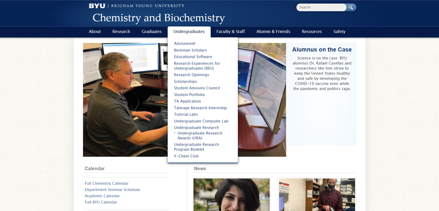
The previous version of the site featured eight tabs, each of which expanded into large drop-down menus.
Because I was instructed to design the new site without drop-down menus, the updated tab structure needed to be effective and efficient, quickly routing users to the desired content. To begin, I created a site map to understand the existing structure. Adding analytics data to the map gave me real data about how often the pages were accessed.
In addition to the site map and analytics data, I surveyed all faculty and staff members to understand how they used various pages to accomplish their goals. Much of the Chemistry site’s information is found in PDFs and documents attached to the site but did not appear in the analytics data, so the survey expanded the data from analytics.
Interestingly, the documents were used even less than we expected: over half of the respondents indicated that they never used 30% of the documents* available for faculty and staff members.
*Count does not include faculty-specific documents
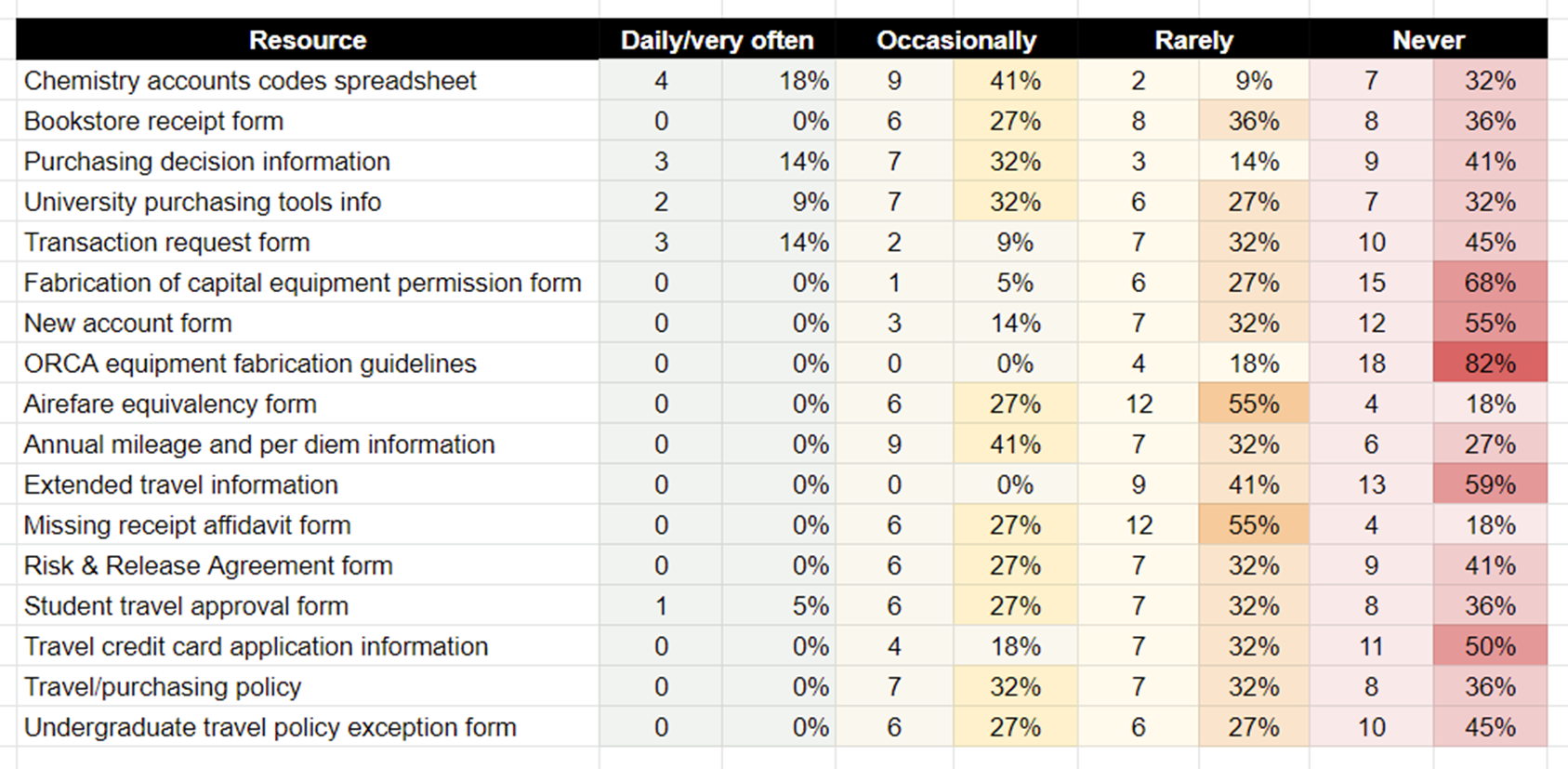
Over half of the respondents stated that they never used 30% of the documents listed.
Knowing that so much of the content was not being used allowed me to determine what could be removed from the site. Even though my role did not included content management, identifying which content should be kept allowed me to create a more accurate information architecture.
Design Process
With the context gathered from my research, I was able to make informed decisions about my designs. I reduced the number of links in the navbar from eight to six to focus on different aspects of the department as well as facilitate access to the most frequently accessed pages.

The new navbar structure targeted our main user groups as well as the most frequently accessed pages.
The new tabs also supported the department's goal to center the site around prospective students, current students, and donors. "Academics" would funnel students to information about classes and program logistics, while "Research" provided access to information, jobs, and opportunities within the department's research program. Donors, too, could learn how to contribute to the department through the "Community" tab.
With fewer tabs, however, we needed a way to instantly funnel users to applicable content. To accomplish this, I created a landing page for each tab that featured a hero banner and a short sidebar. This meant that users could access the majority of the site's content within three clicks.
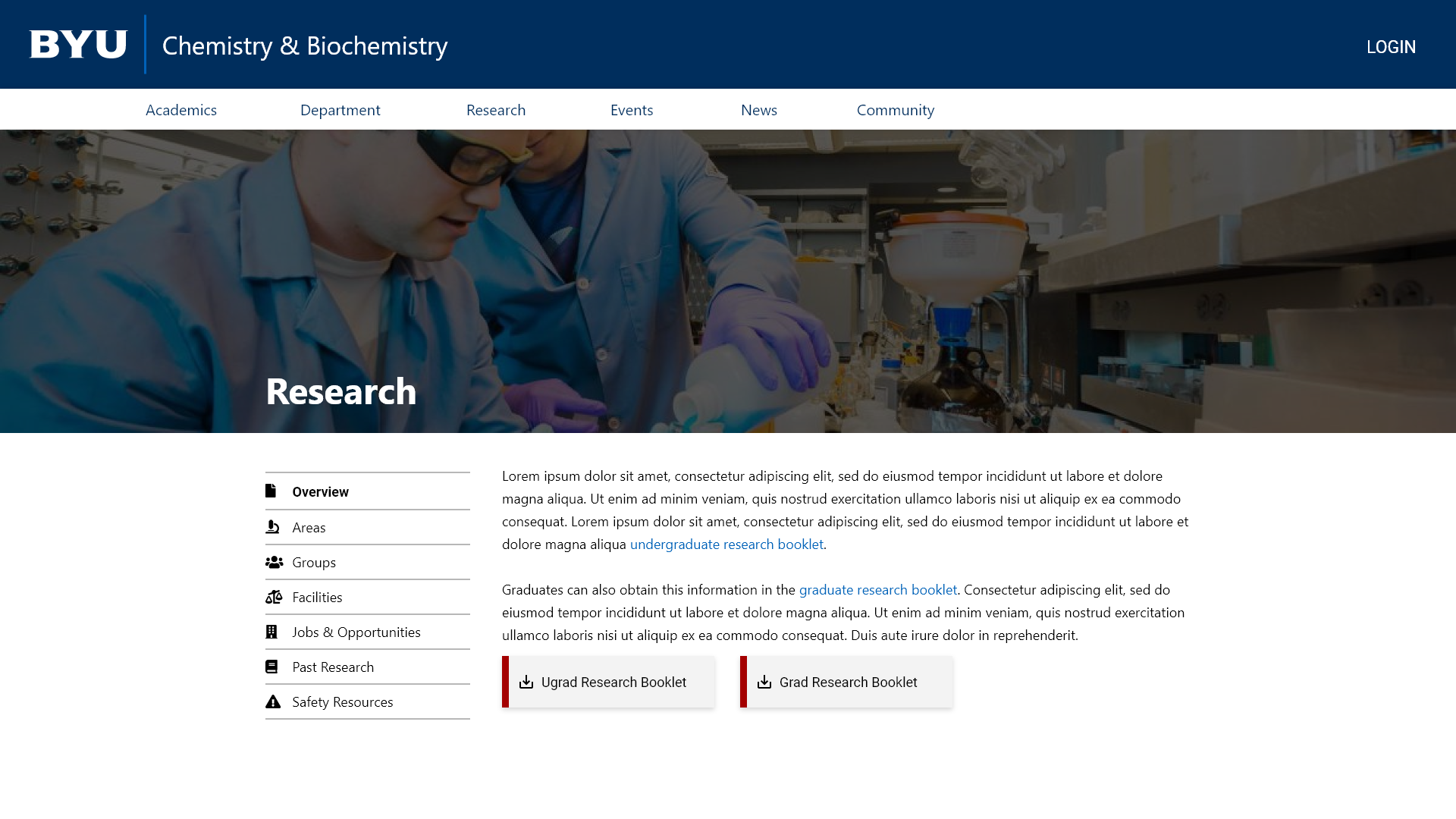
One of the new landing pages that quickly directs users to top content.
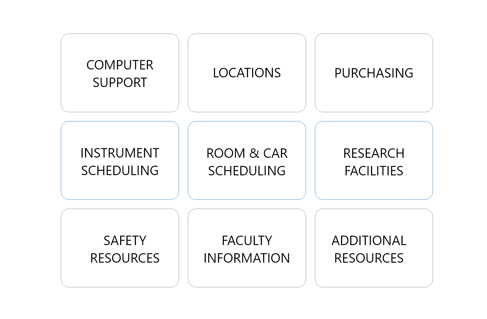
Despite the site's new focus on students and donors, we still did not want to create difficulties for faculty and staff members. To accommodate this additional user group, I designed a dashboard that appears exclusively for faculty and staff members upon authentication. The dashboard wasn't an afterthought, added to appease a set of stakeholders; rather, I designed it to be a central hub for faculty and staff to find the information and resources they access most frequently.
At the same time I surveyed faculty and staff members about their content usage, I also asked which departmental resources they used most often. Using this information, I created quick links for the top four most popular resources with a link to access all other departmental sites. A section for the information and forms was added to provide information not available via a link.
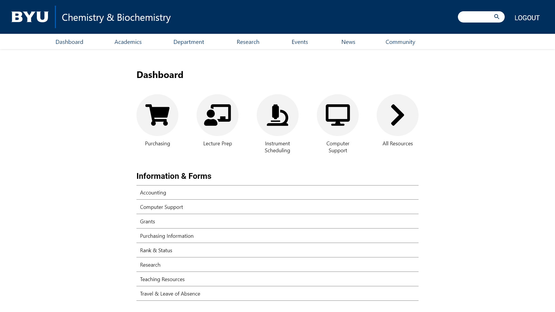
The new dashboard allows authenticated faculty and staff members to quickly access the content they use most often, while hiding it from other users to reduce the clutter of content.
With a large prototype based off the research I had initially gathered, I knew that usability testing was necessary to ensure I had applied user feedback in an effective way.
Usability Testing
To validate my designs, I performed user testing with 6 faculty members, 3 staff members, and 3 students. While I had hoped to test at least twice that many users, a low response rate and limited number of faculty and staff members made this unfeasible.
For each testing session, I provided hypothetical scenarios tailored to each user's position to allow them to interact with content as though they were using the site in real life. For example, I asked students to pretend they were interested in organic chemistry and wanted to see which professors were doing research in that area. After asking them where they would go to find the inorganic labs, I observed their reactions, carefully documenting their process and thoughts carefully.
Overall, the results of user testing were very promising. We knew that the faculty and staff directory was the most-used page on our site, accounting for nearly 47% of page views, so it was encouraging when users correctly found the location of the page with a 100% success rate. As donations were also particularly important to our stakeholders, we needed to ensure that the path to the donation page was clear. This page, too, resulted in a very high success rate.
While many of our pages performed well, some portions of the Information & Forms section of the dashboard scored poorly, with users finding the correct page just 33% of the time. After detailed analysis and comparing the results with the content survey, I realized that users struggled when the page didn't apply to their role. It was only natural for them to be confused when asked to locate a page whose purpose they barely understood.
In addition to ensuring that the prototype was navigable, I also received multiple insights regarding the general design. One student kept flipping back and forth between the landing pages and the homepage, asking, "Is this the homepage? Or is this one?" His comment helped me realize that the homepage and landing pages had hero banners of nearly the same size, resulting in a confusion regarding hierarchy. In response to this, I reduced the height of the landing page's hero banner by 13% to more clearly delineate the different page levels.
After making several of these minute yet powerful design changes, the prototype has been finalized and is waiting for final approval before being developed.
Lessons
This project taught me the importance of incorporating data into design decisions. By combining information from analytics, surveys, and user interviews, I was able to create a cohesive design and more user-friendly information architecture.